Magazines: Front cover practical project
1) Use Google to research potential magazines that you could use as your brand/design for this project. Create a shortlist of three potential magazines and upload an example front cover from each one. We recommend looking at lifestyle magazines or a similar genre as these are more achievable to re-create.
NME:
2) Choose one of the three magazine brands to use for your project e.g GQ, Vogue or The Gentlewoman. Then find three different front covers for your chosen magazine and embed them in your blogpost. Analyse the fonts, colours and typical design. What is the language or writing style? How are the cover lines written? What camera shot is generally used for the cover image? You need to become an expert in the design and construction of this magazine and its branding.

Rolling Stone: 

Metal Hammer: 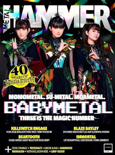

2) Choose one of the three magazine brands to use for your project e.g GQ, Vogue or The Gentlewoman. Then find three different front covers for your chosen magazine and embed them in your blogpost. Analyse the fonts, colours and typical design. What is the language or writing style? How are the cover lines written? What camera shot is generally used for the cover image? You need to become an expert in the design and construction of this magazine and its branding.
Chappell Roan:

The Rolling stone Masthead has a common theme of cursive writing for its name throughout it's publications. The typical design has the Masthead and any relevant news above it; the date in the top right corner, under the masthead, the main image/ star power which takes up majority (and in this case all) of the space on the cover. The colours always relate to the specific artist on the cover, whether it be in relation to the artists music. Which is the case for Chappell Roan's cover, as the colours of red, white and blue relate to her latest album -which was very political and related to American Politics.
Language or writing style - The language is very short and snappy, there’s not much on it, I think this was done to just capture the audience attention. As it’s a known fact that the younger generation has a shorter attention span and so I think the language here is used in the right way. The typography is a type of cursive serif font, with the artists name and the slogan attached to it in white and the magazines name in Red.
How are the cover lines written? - There aren’t any prominent cover lines on this magazine but the ones that are there are in small fine print and so aren’t meant to take up any attention from the cover image.
What camera shot is generally used for the cover image? - Medium shot, where we can get that closeness from the artists. She is posed in a way that recaptures the way of traditional voguing( a dance form originating in from the LGBTQ+ community), an ideal for which she actively advocates. With her exaggerated make-up, it also reinvents the look of a drag Queen.
Benson Boone:

Font, colours and typical design - The colour of the boarder of the magazine is in a pastel rainbow, including the Rolling Stone masthead. The font is in serif and the typical design is quite colourful all round.
Language or writing style - The writing is very professional and pays homage to the artist and the writing style is very short and snappy. The typography is consistent throughout the cover, in white letters, boldly separating them from the background colour. The main headlines of the cover lines are written in block white capitals, with the little subheadings underneath.
How are the cover lines written? - The cover lines depict the other artists that will be featuring in the magazine as well as some news above the Masthead, depicting them to not only be an entertainment magazine but also an informative one. The magazine therefore presents itself to be a nuanced magazine, made for any and all types of people. Some of the cover liens are very serious in comparison with the theme of the cover ie. "From prep school prodigy to accused murderer"
What camera shot is generally used for the cover image? - A medium shot, with direct address towards the audience. The artist has this longing look in his eyes, communicating a sense of sorrow in his eyes.
Ice Spice -

Font, colours and typical design - The boarder of the magazine is a muted orange, in reference to Ice Spice's icon orange hair, the masthead adopts with colour too. The font is the typical serif font all around the cover with Ice Spice's name in big bold white letters and the cover lines written in black smaller letters, drawing attention to her name.
Language or writing style - The language used is very colloquial with her slogan being "on fire", a slang term often used by the younger generation to describe things that are very good or in this case - popular.
How are the cover lines written? - The cover lines surround her face but don't pull attention from it and they convey which artists will be featured in the magazine.
What camera shot is generally used for the cover image? - headshot/close up
Planning
1) In your blogpost, write your main cover line (also called the 'main flash') - this is the main cover story that links to your central image. It must be 100% original - all your own words.
South Arcade - Putting the POP back in PUNK
2) Briefly plan the image you will need for the cover - model, costume, make-up, lighting etc. At this point, simply describe the image you need to capture.
Model - me
Options for poses - fisheye with hands grabbing at the camera, holding a guitar sitting posing it above the head or holding it on the floor, direct eye contact with camera, crawling on floor towards camera
costume - black skirt, black or burgundy fishnets, black boots with buckles, tight black or white top, silver jewellery.
make-up - sliver/ white eye shadow, black eyeliner, normal beat, mo hawk loc style or pigtails
lighting - colourful lights , or dim lighting with colourful back drop.
3) Write the cover lines and any additional text you need for your magazine cover.
The ins and outs of: the music industry
a song inside scoop: Rob Stringer
Floras’ rise to fame
Doechii: her creative journey
Musicians on musicians: Måneskin, The Cranberries, Yungblud, The Linda Lindas, Maximo Park, Fly Leaf and Finger Eleven
Above Masthead: Nuevo Punk
4) Sketch out your cover on plain A4 paper using your written planning. Take a photo of your sketch and upload it to your blogpost.
4) Sketch out your cover on plain A4 paper using your written planning. Take a photo of your sketch and upload it to your blogpost.

Photoshoot
We will do a photoshoot in class next week with lighting and backdrop. However, if you prefer you can arrange your own photoshoot for the cover image in your own time - you can use your phone or your own camera to take an image. If you don't have a phone or camera that is suitable, you can sign out a camera from Mr Ray.
1) On your planning document blogpost, state the date, time and location of your photoshoot and the name of the model or photographer you will use (you can choose anyone to be your cover model or you can be the cover model yourself).
date: 6/05/25
date: 6/05/25
time: 3:00pm
location: School, DF06
Photoshop or InDesign?
You will have one Media lesson to create your magazine cover on Adobe Photoshop or InDesign but you will probably need more time than this. In order to complete this work, you will need to work in DF06 when you don't have other lessons or use Photoshop/InDesign at home. You already have access to Adobe at home via our fantastic Adobe Creative Cloud subscription (worth around £25/month!) as long as you have a PC or laptop that can run it.
Online tutorials
The best way to learn Photoshop is simply to start creating your magazine cover and learn as you go. There are thousands of tutorials on YouTube to help you - here are just a couple of examples of Photoshop tutorials:
Publication to blog and evaluation
1) Once you have completed your design you need to save or export a copy as a JPEG image. Then, upload it to your blogpost.
2) Upload two genuine covers of the magazine you have used and put them next to your front cover. This is a brilliant way to check how professional your work looks alongside the real thing.


3) Write a short evaluation of your work: have you succeeded in your brief to create a new, original edition of an existing magazine? Does your cover stand up alongside the genuine covers of your chosen magazine? How professional is your work alongside those genuine examples?
I believe I have succeeded in my brief to create a new, original edition of an existing magazine. However I think you're able to tell that this was amateurly made due to the sheer amount of obvious editing in it. The fonts I chose align with the theme of the magazine, similar to the other two magazines that follow their theme. I have also got a barcode and a price tag as well as the 'UK' tag underneath the masthead.
4) Finally, what would you do differently if you completed this assignment again?
I didn't include a tagline above the masthead like some of the other magazines, although only some of them have it. My tagline is under my headline, purely for spatial reasons. I also would have taken the picture in front of a real life background like 'The cures of the the Ramones' background. As editing the background to a very long time and I think having a real background, for example just a wall in front of a house, represents the Punk genre more. As they pride themselves on connecting with ordinary people and condemning the status quo.
Comments
Post a Comment